Project Overview
When discussing internal projects with my colleagues, we recognized the need for a design system to provide clear guidelines for components and foundational elements like button sizes, spacing, etc. This resonated strongly with us, as the irregular Figma components currently used can lead to inconsistency and confusion. Establishing a design system would ensure consistency and ease for both current and future designers working on internal projects. what we need to do is recreate old components, gather all old use cases, and create use cases for each component
***Please note that original graphics & client specific terminologies have been replaced / remove for demonstration purpose in compliance with confidentiality & non-disclosure agreement (NDA)
Goal Of The project
central hub for accessing components, patterns, and styles in one place
Less focus on visual tweaks frees up resources to tackle complex problems, ensuring consistent project design and functionality.
Quickly replicate designs using pre-made components and elements.
Eliminating inconsistency.
Minimizes wasted time due to miscommunications in design and development.
Research
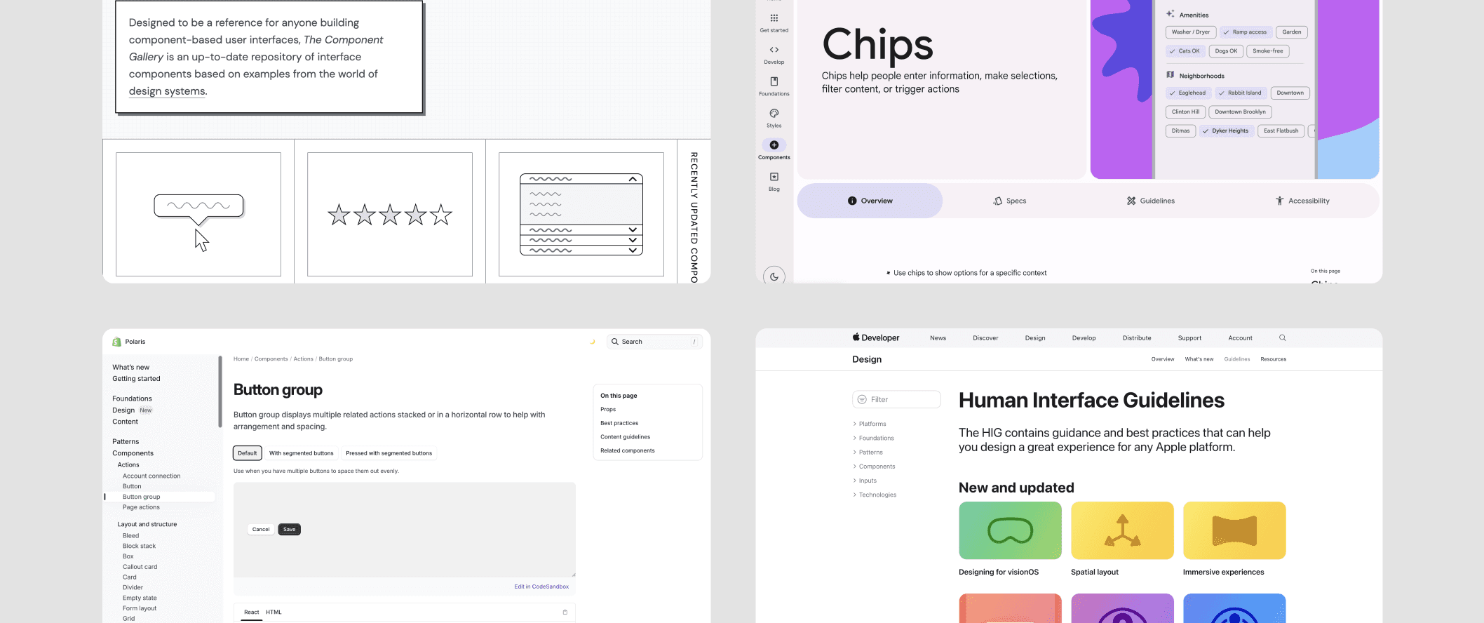
I'm picking up where my colleague left off, continuing their work on components. Before diving in, I've been studying design systems from major companies (example: Shopify's, Apple's, Google’s, & Atlassian's design systems) to understand the basics. Analyzing my colleague's work and comparing it to industry standards helps me identify additional components we need, based on our common usage and benchmarks set by leading companies.
The Design Guide Consist of
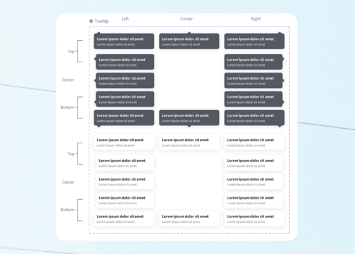
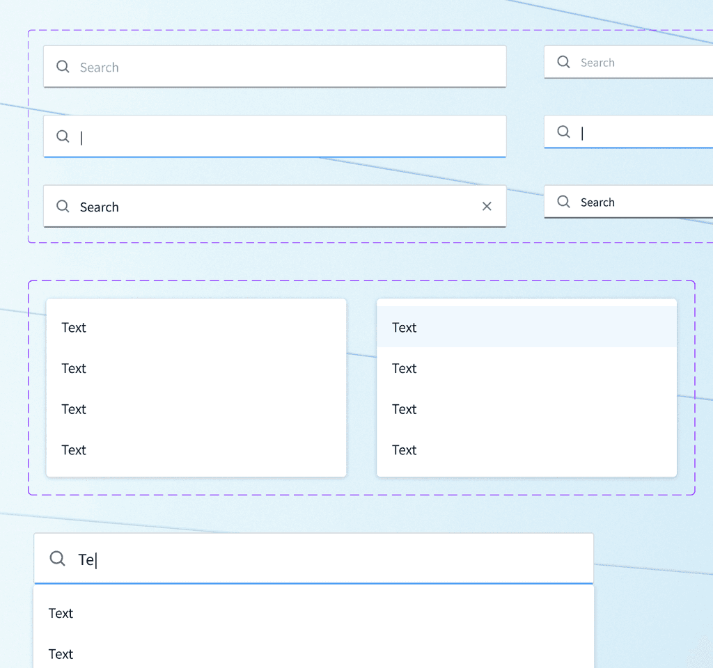
Component
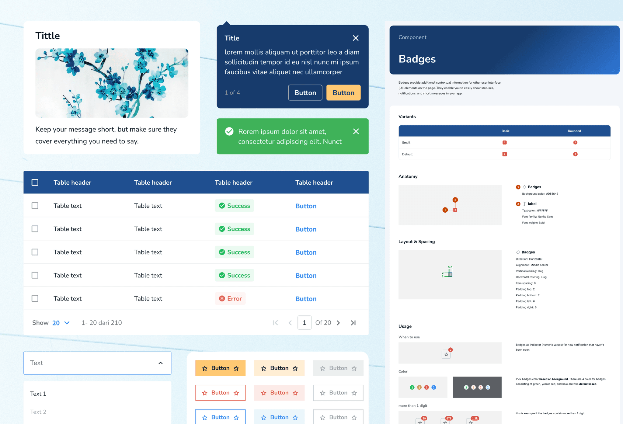
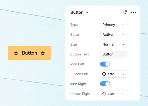
We make our component based on atomic design principle, using nested components, and states of the components. We also make notes & descriptions to understand what component you were looking at.
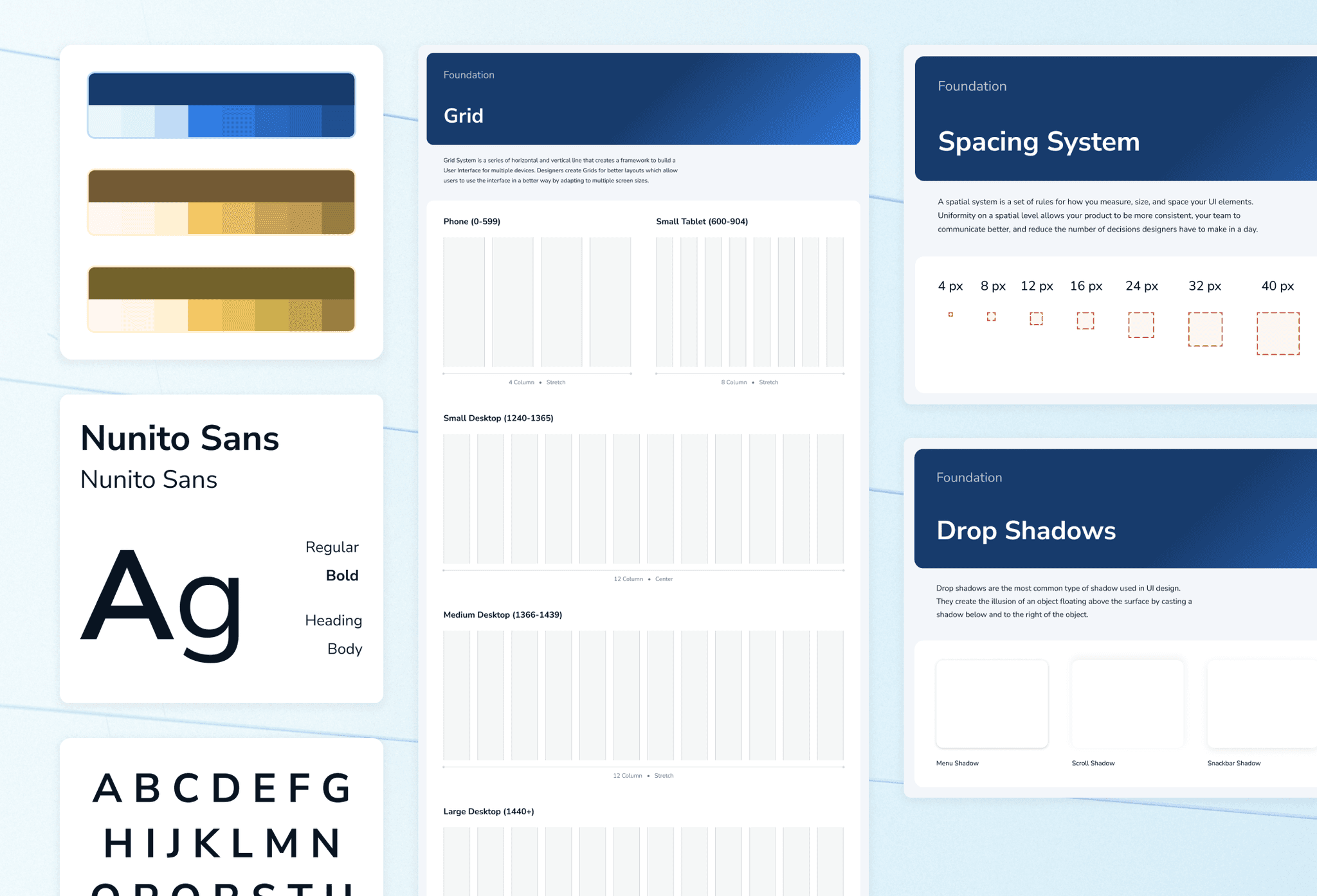
Foundation
It consist of color, typography, icon, shadow, spacing & grids. These style guides are incorporated into the component library as well, to provide relevant guidance in context.
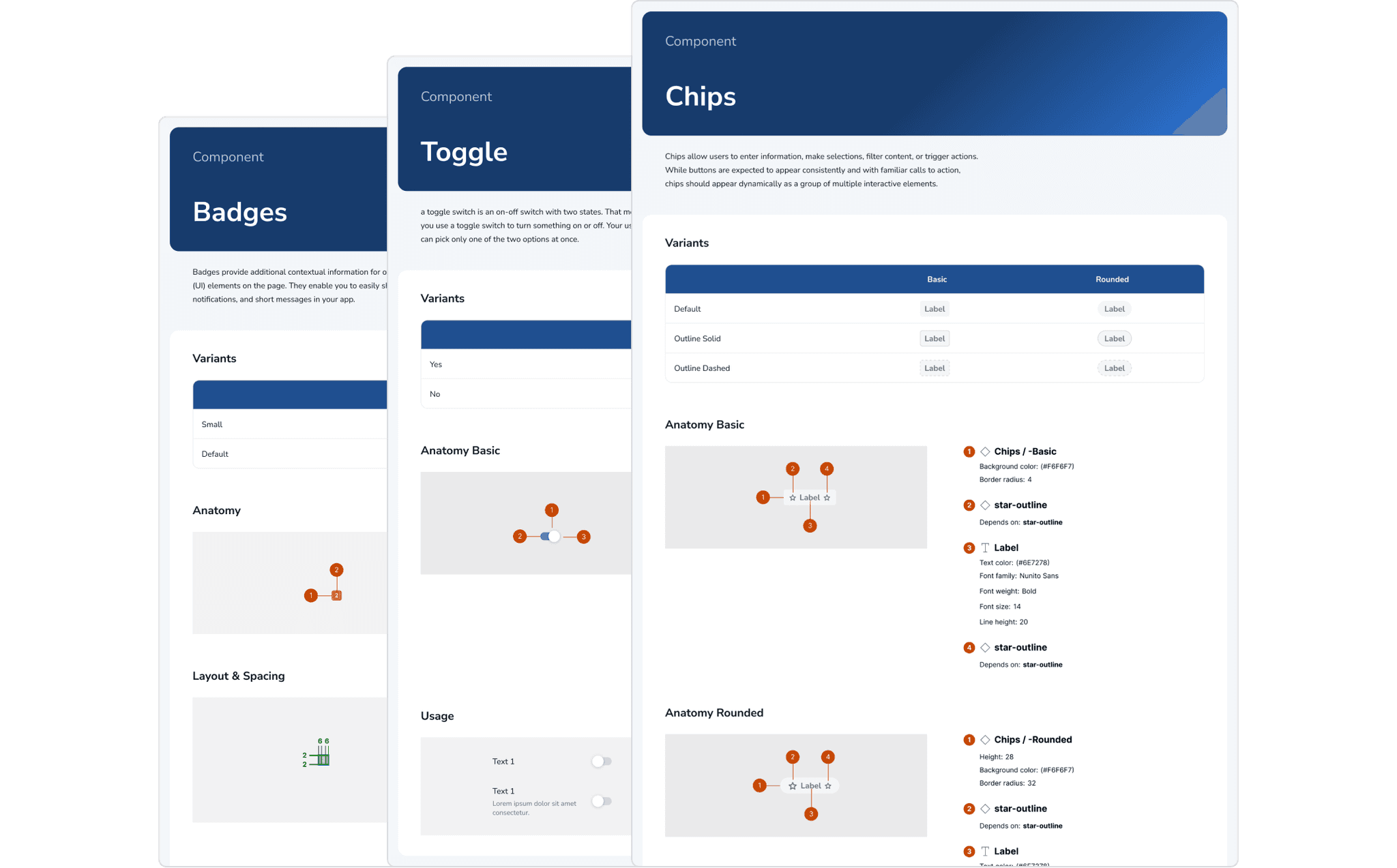
Documentation
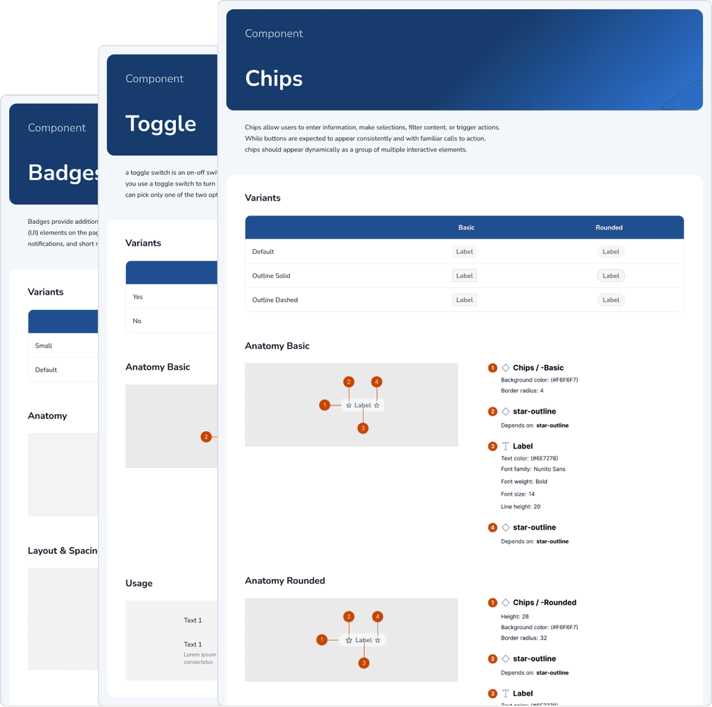
We make sure each component comes with its own documentation, all conveniently located on the same page. We write everything thats important like structure, spacing, properties, and how to use it in different scenarios.
Keeping it simple and scalable
We built the system to expand with atomic design principles, nested components, and simplified variants.
Vision & Future Development
Designer & developers collaborations to include tokens, CSS class, and code snippets
Iteration of which components will be needed for reuse and which elements are specific for edge cases
Website Design System
The Challanges
The main challenge of this project was collecting components previously used in internal projects while identifying new ones for future needs or edge cases. Another hurdle was creating nested components and applying atomic design principles, which, although time-consuming, ultimately made the system more structured and easier to use.
Things That I Learn
The importance of atomic design & nested components! Even though it's complicated at the beginning, it makes it easier in the end & I learned a lot from that experience
See enough references! to compare what components we need & benchmark component patterns


