Project Overview
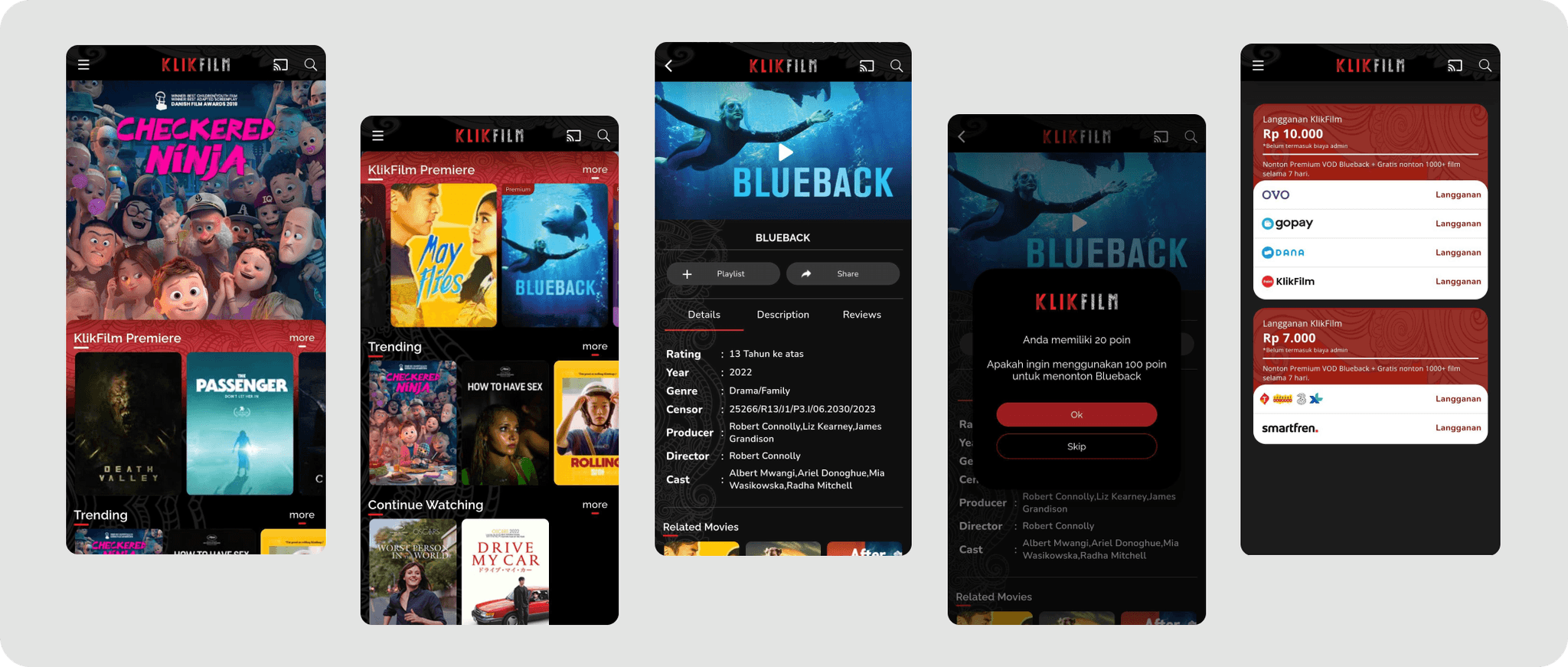
This case study is not related to Klikfilm, i embarked on this project out of my passion for this app & films. Klikfilm, launched in 2015 by Falcon Pictures, is a film streaming service platform. Users can watch films either by subscribing (monthly, 7 days, or 3 days) or by renting premium films. My task is to identify features within the application that can be improved in usability & experience.
Starting Point
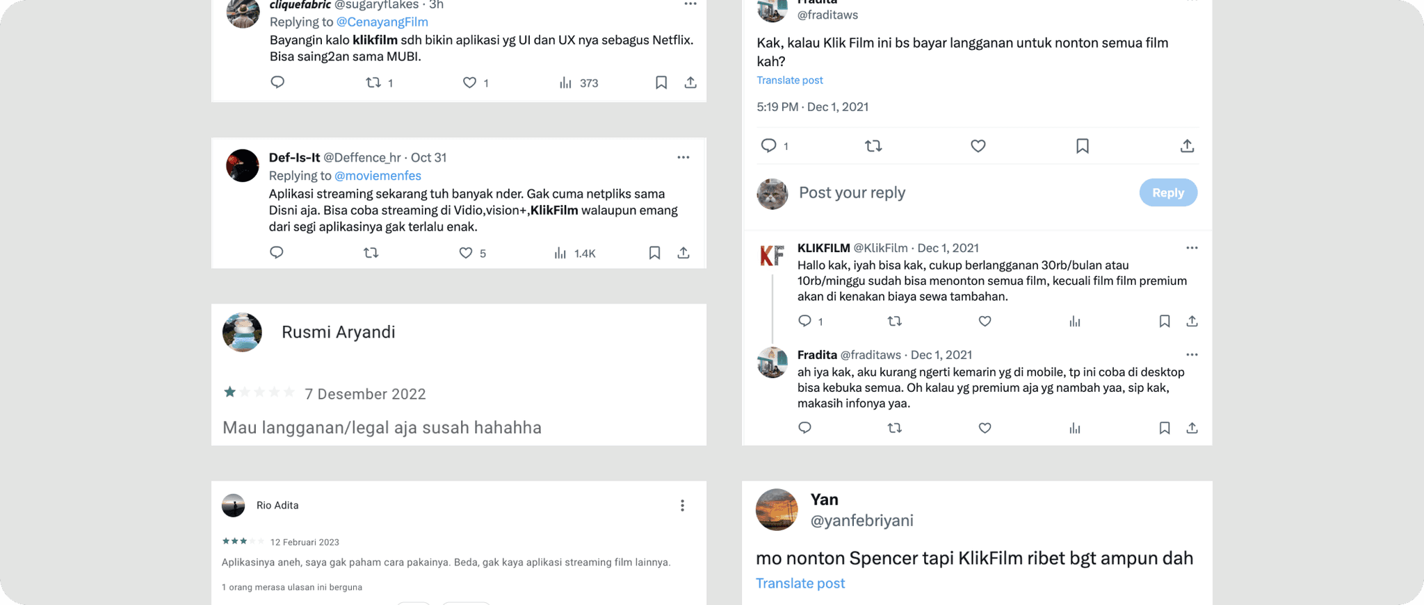
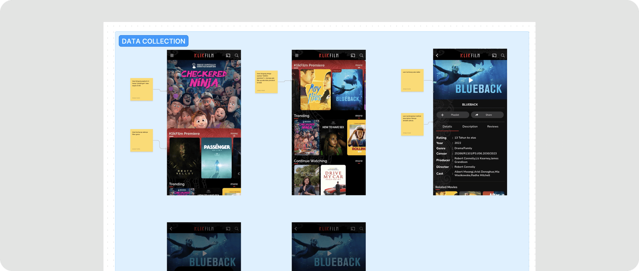
To begin, I tried using the application and noticed several confusing aspects: the definition of premium films, the varying movie prices, and the purpose of points. The app lacks usability, clear information, and a seamless user experience. Next, I conducted research by reviewing feedback on Twitter and the Playstore, where I discovered numerous negative comments about the application.
Problem Statement
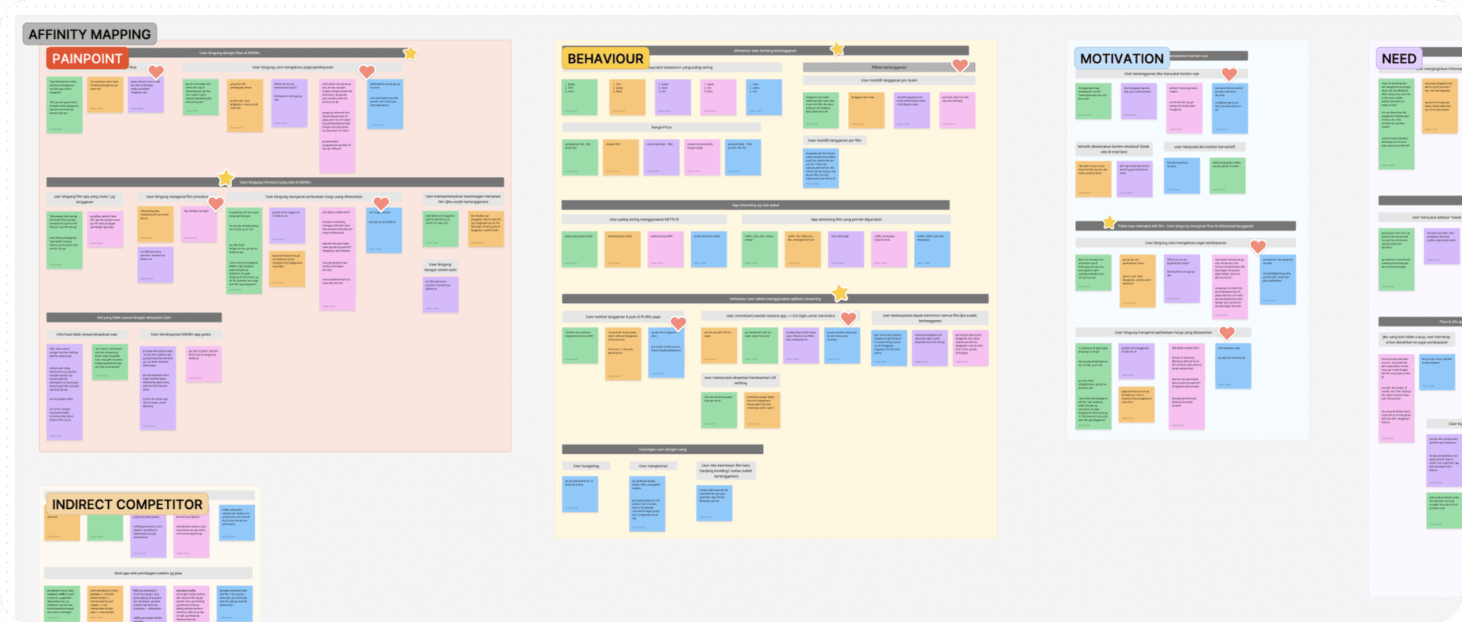
I conducted qualitative research, usability testing, & interview to understand user painpoints.
"lack of information regarding subscription & rent"
Users are confused about how to rent & subscribe films on Klikfilm
Users struggle to understand information and can't easily find how to subscribe / Rent.
Users are not aware of the existence of premium films
Research Goals
User Side
Streamlines the subscription process and provides all the necessary information users need when subscribing.
Business Side (RARRA metrics)
Enhance activation by improving the user experience & providing clear information aims to attract new users to Klikfilm which aims to provide pleasant experience and highlight the positive aspects of the Klikfilm application.
Research Insight
I've conducted interview & two usability tests, achieving success rates of 88.57% & 100%.
So…if the UT results are above average, why does it need to be changed?
3 / 5 users don't want to use Klikfilm again after experiencing task 1 (rent a film)
4 / 5 Users are confused by the price difference after experiencing task 1 (rent a film) & task 2 (subscribe)
Because Klikfilm's business goal is in the activation stage, it is a bit worrying that the majority of users will not want to use Klikfilm anymore after task 1 (rent a film), because the film rental feature is intended to attract new users.
What we discovered isn’t working currently
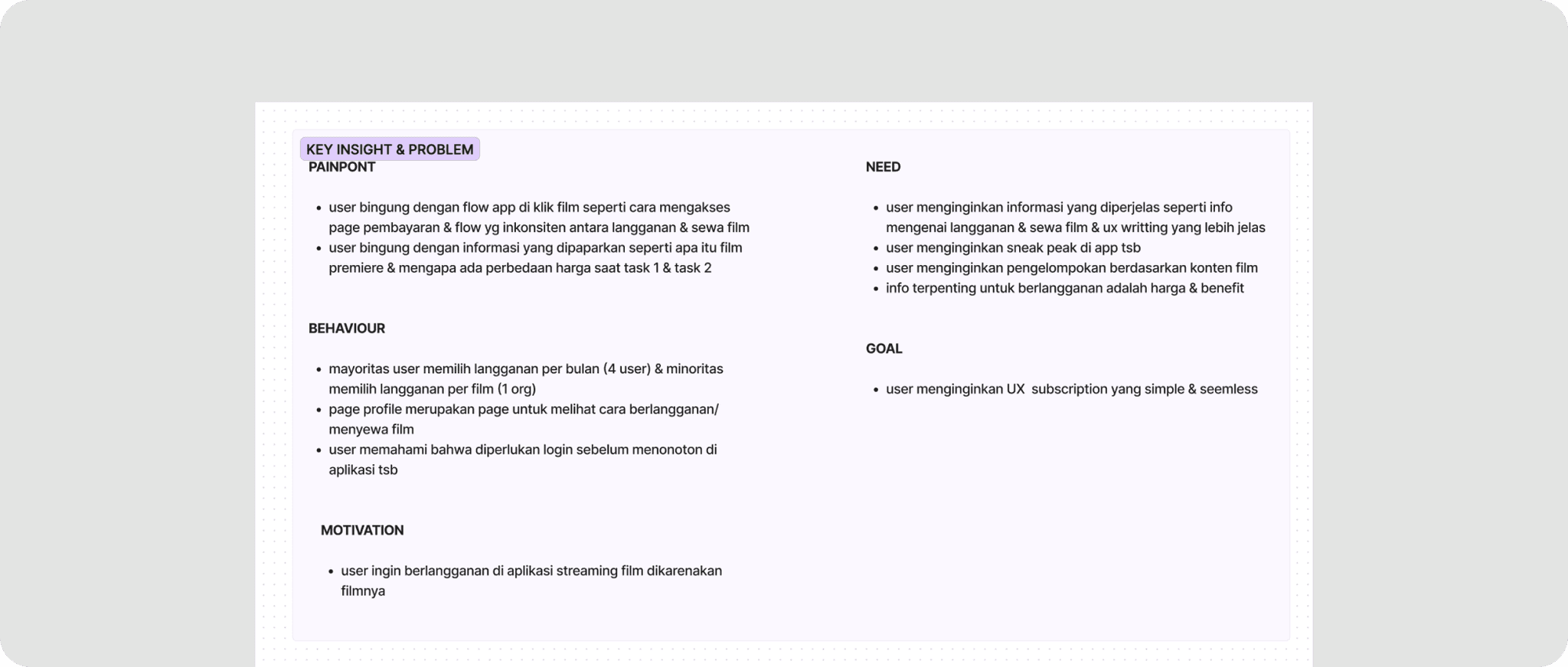
Users are confused with the app flow when clicking on a film, such as how to access the payment page & inconsistent flow between subscribe & rent a film.
The user is confused by the information presented, such as what a premium film is & why there is a price difference.
Where we want to be
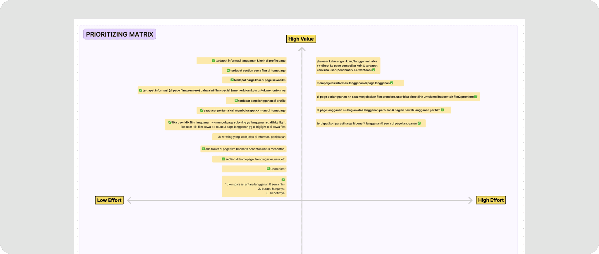
Give clearer information such as info regarding subscriptions & films rentals.
Give sneak peak in the app.
Grouping based on movie content.
The most important information for subscribing is price & benefits.
Comparative Analysis
During the interview, I asked which apps had the best subscription info and flow, and the best content division. Users mentioned Netflix and YouTube. Some likened the app to Apple TV, while others recommended a top-up coin system similar to Webtoon and Chaiyo.
How do you clarify information on Klikfilm?
How to improve UX flow at Klikfilm?
How do you make it easier for users to use Klikfilm?
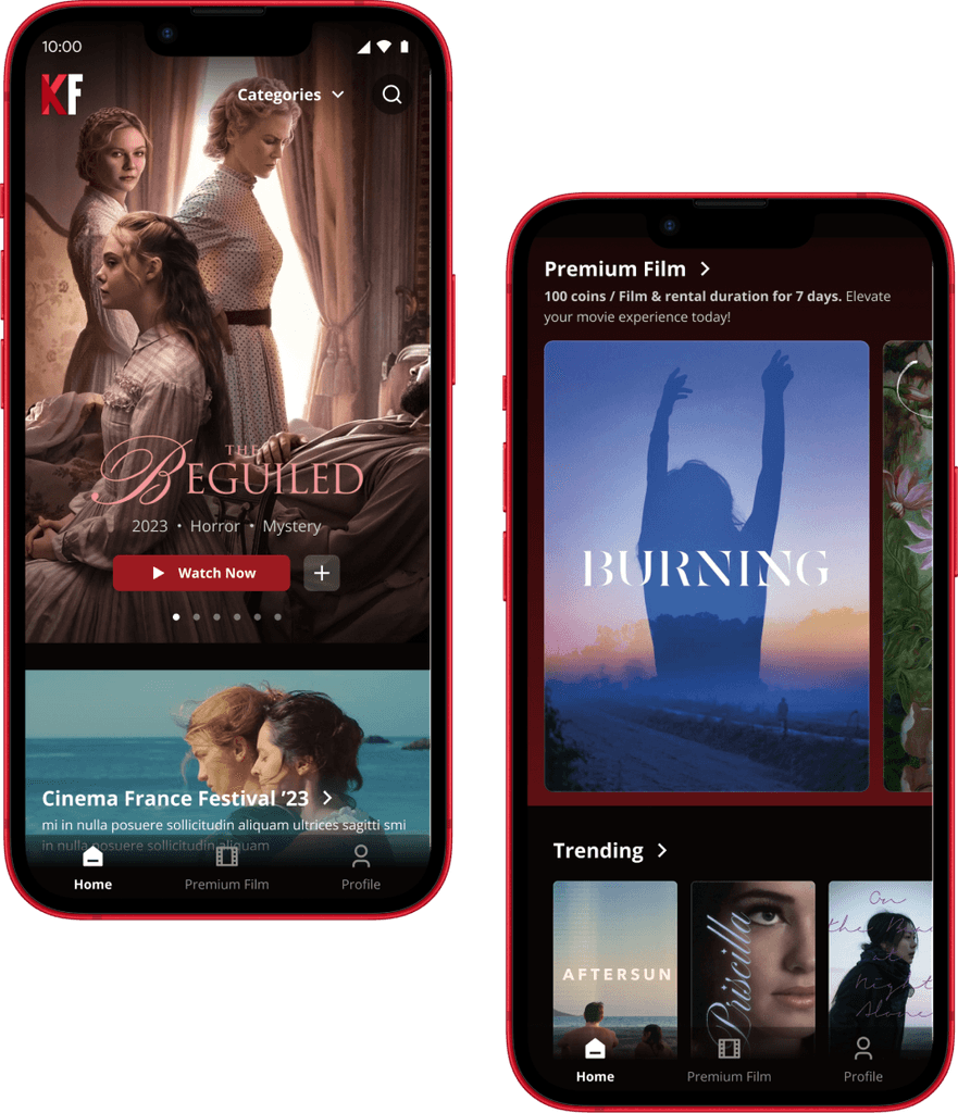
Enhance Landing Page & Premium Film Details
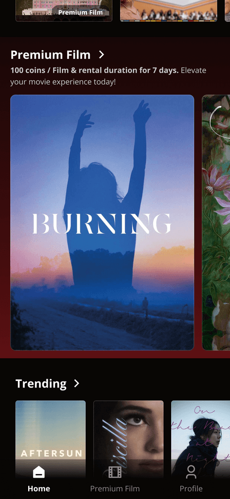
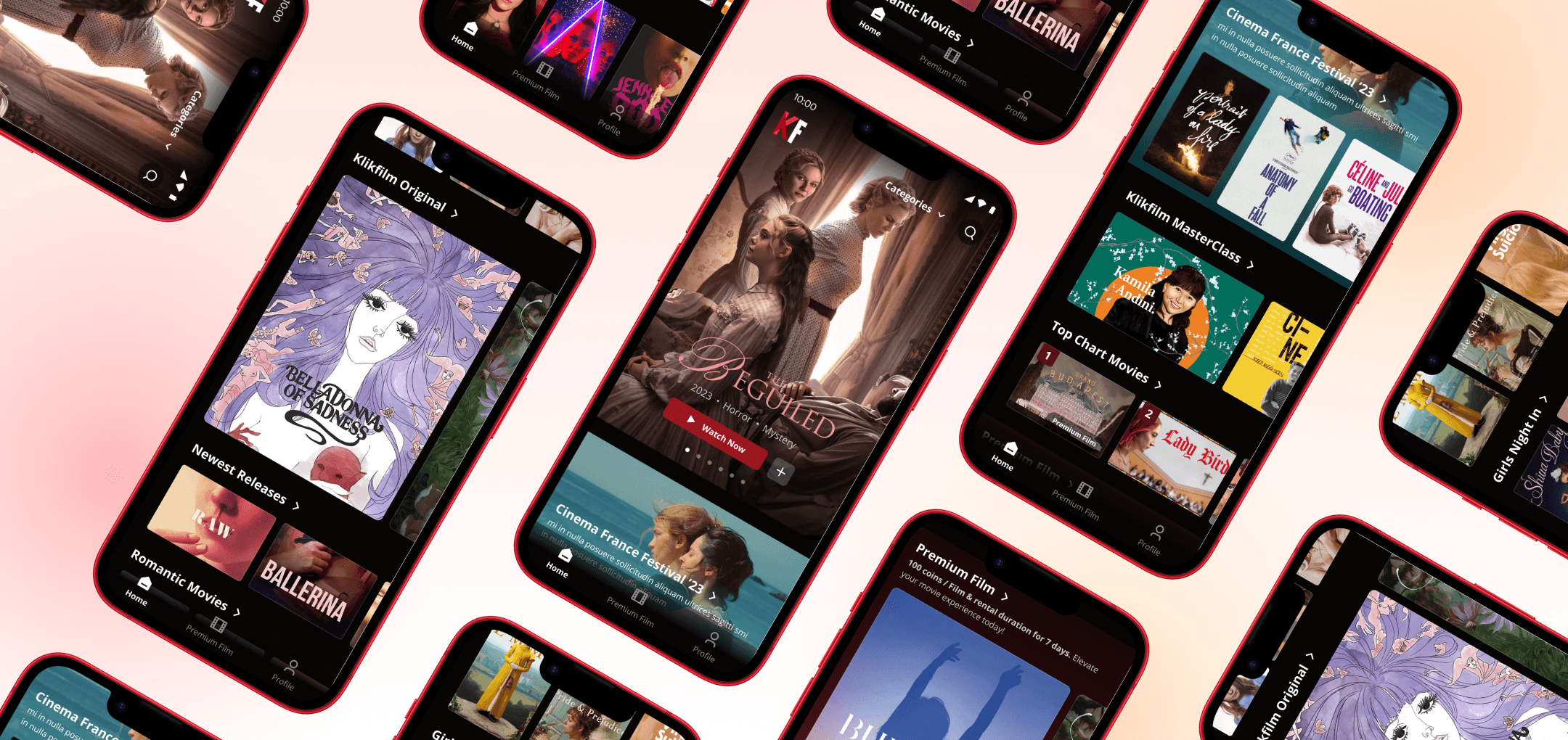
Revamping the homepage content structure based on benchmarks from leading streaming apps, prioritizing limited-time events. In the premium film section, varying image sizes and detailed explanations help differentiate it and ensure users quickly find the information they need.
Before
After
Simplify Subscription Flow
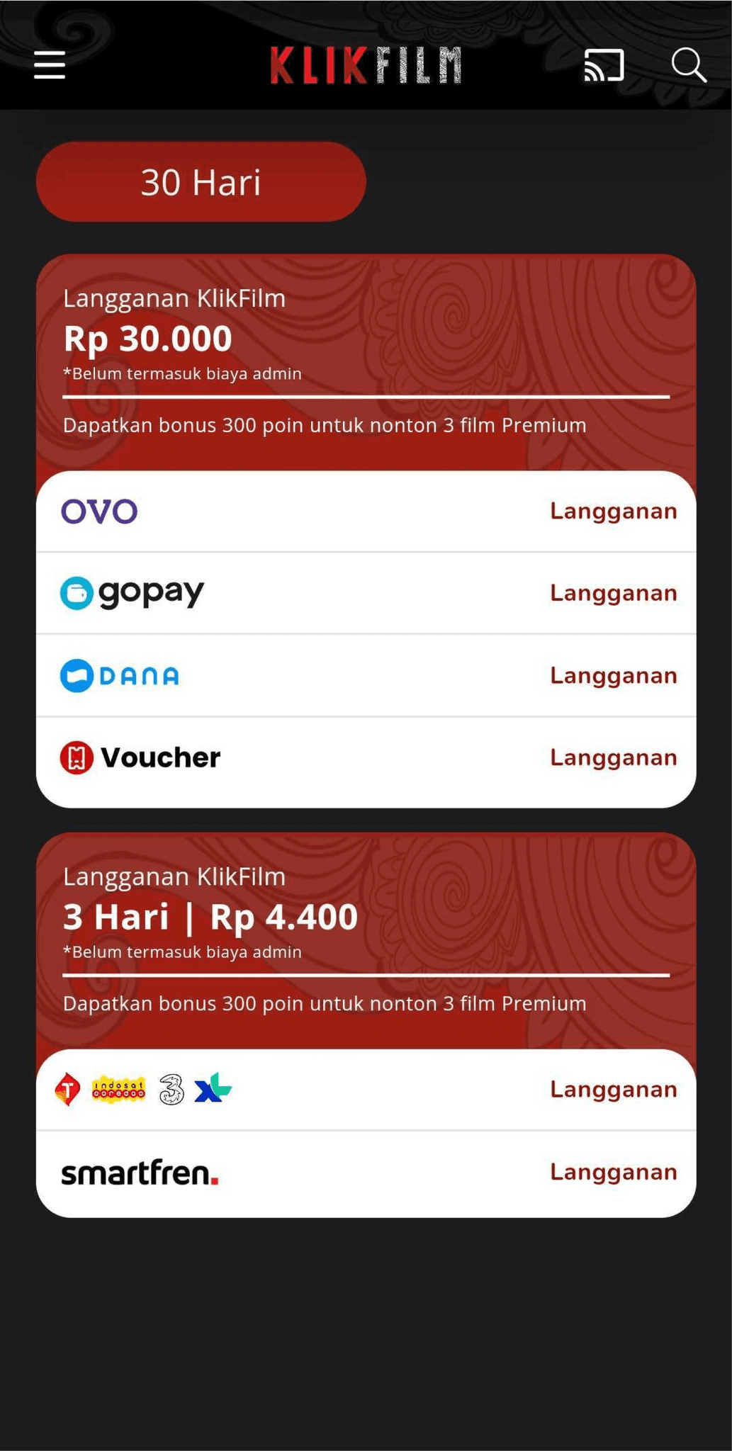
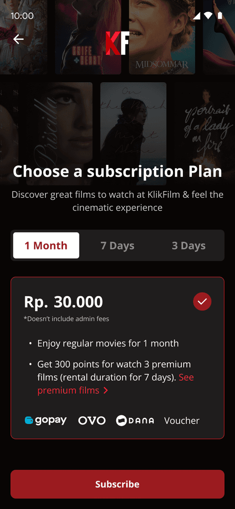
After the user selects a film to watch & log in, the user will see a subscription plan based on the length of the subscription. This makes it easier for users to compare subscriptions.
Before
After
Simplify Rental Flow
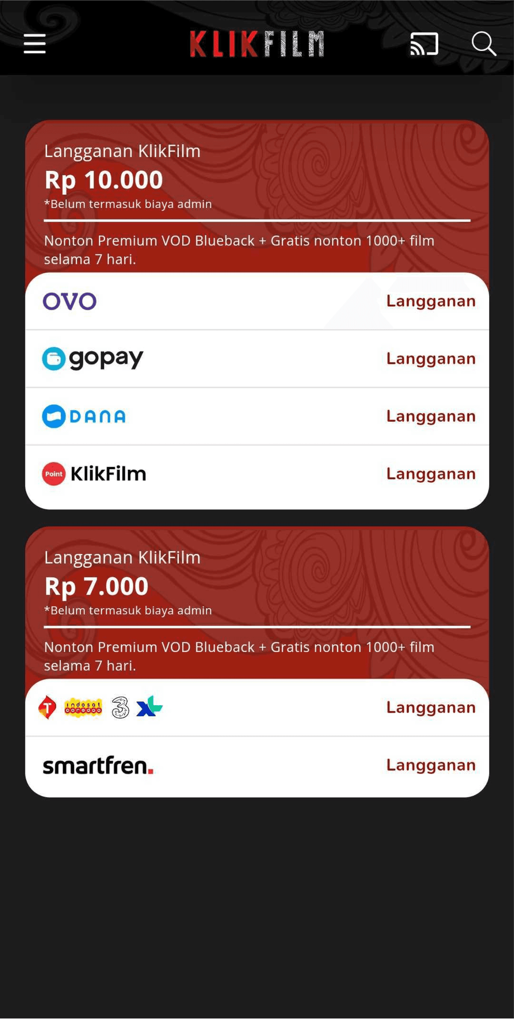
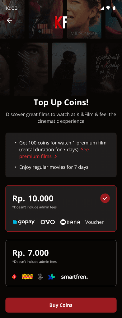
In the premium films section, a 'Rent 100 Coins' button clearly indicates that the film requires a rental. After selecting a premium film and logging in, users are directed to a page where they can purchase coins.
Before
After
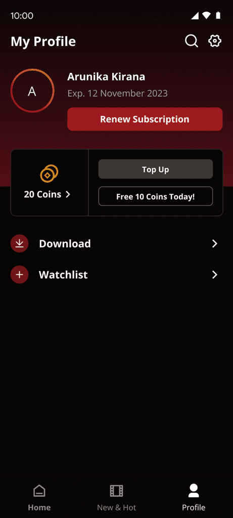
Improve profile information
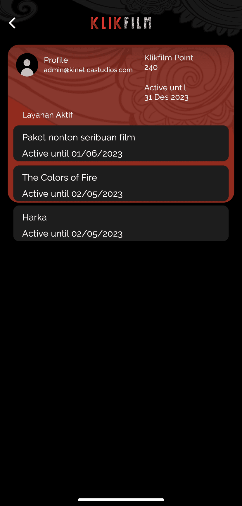
Users have the option to subscribe or rent films directly from their profile. A distinct background color difference indicates whether the user has subscribed or not, providing quick visibility of their subscription status.
Before
After
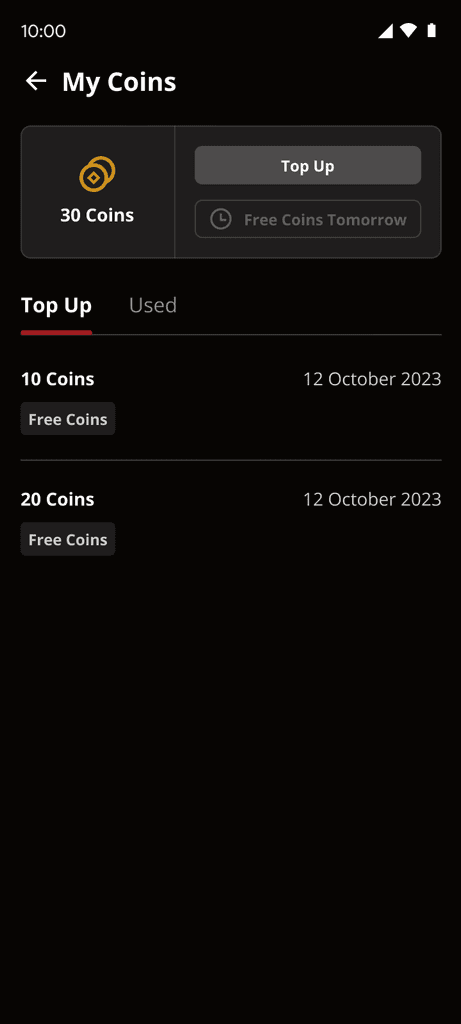
Enhance Coin Top-Up Flow & History
Users can easily top up coins, view coin usage history, and access free daily coins through their profile. The addition of a 'Free 10 Coins Today!' button notifies users of daily free coin availability, encouraging engagement with the app.
Before
After
New UI Design Style Approach
I find it difficult to do design improvements with the old design style guide. Therefore, I design a new style guide that aims to make us easier to develop and improve the design.
The Challanges
The difficult thing is where you have to think about significant user needs to increase it from the business side as well. Difficulties are also felt during usability testing and interviews where we have to ask the right questions to get the right answers.
Things That I Learn
Customer Centric Approach! Using the app doesn't ensure ease or meet user expectations. To enhance value and boost conversion rates, we aim to understand user perspectives and fulfill their needs.
Research on direct & indirect Competitor! We need to see what applications users frequently use according to our needs so that we know user behavior & mental models.
Think About business side! It is important to consider the user when developing a product. However, it is equally crucial to remember that the app can only thrive if it can generate revenue. Therefore, we should identify problems that not only benefit the user but also contribute to the success of the business


